Bob’s
Rebranding


by Tátil Design
for BOBS
Challenge
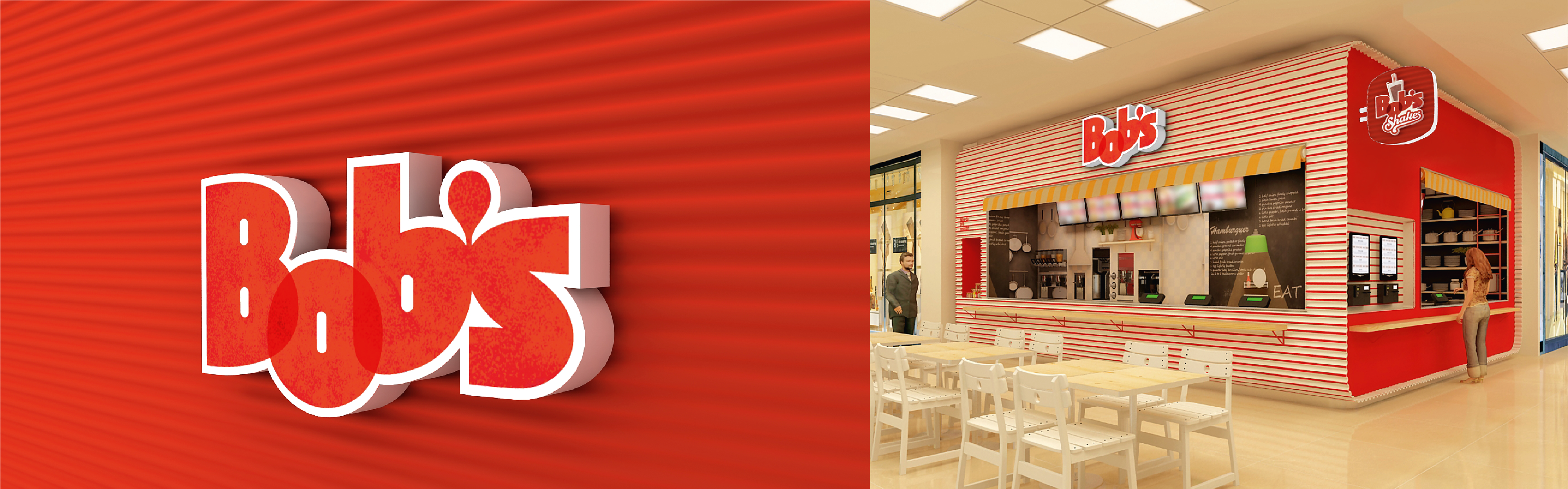
Even following an American business model, Bob's Burgers has always had a very particular way of being a fast-food restaurant: more smeared, more informal, and much more yummy. However, due to the competition growth and the standardised American model, Bob's has lost its essence throughout time, looking like something it never was. After a whole repositioning process ,we were invited to shape this new concept and this new moment of the brand.
Solution
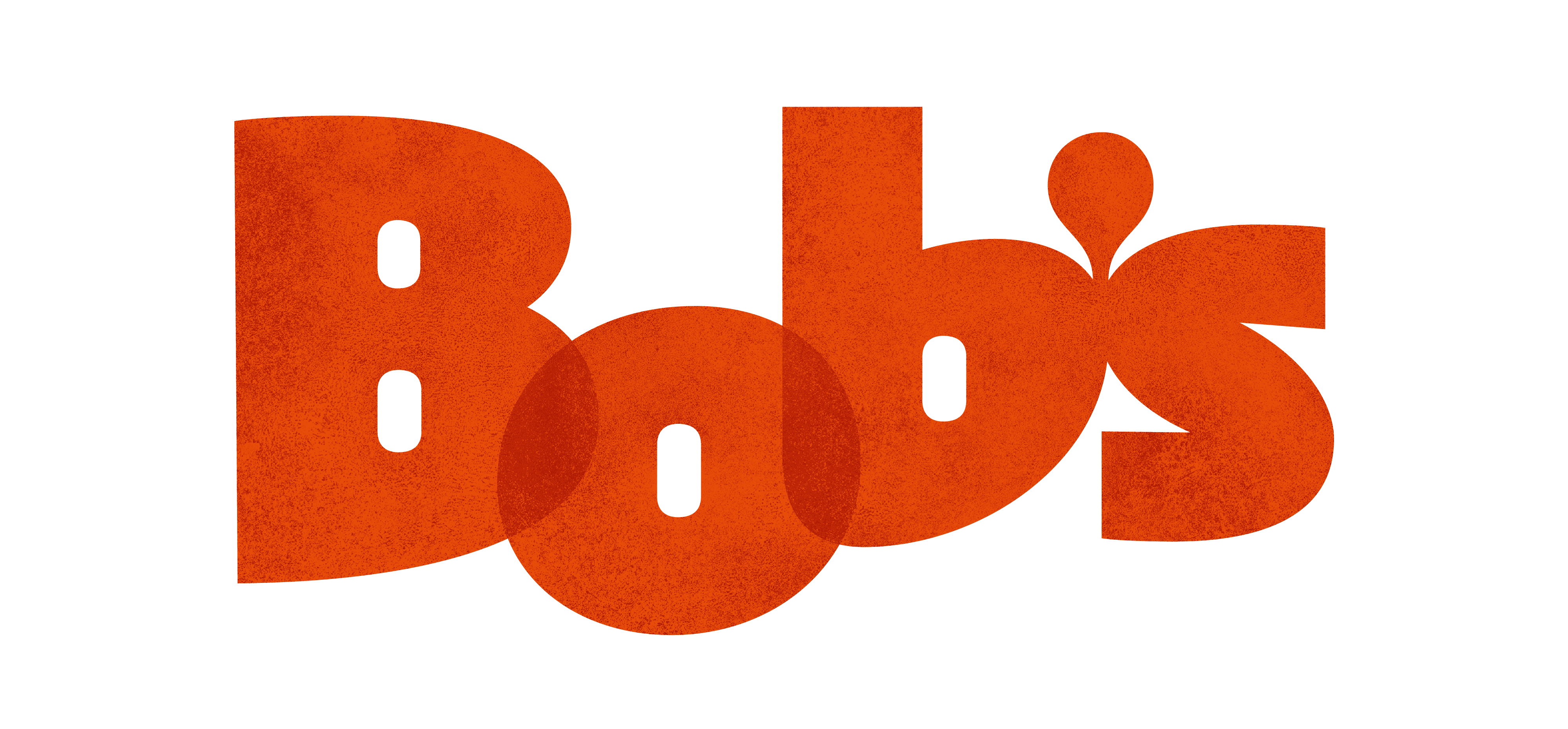
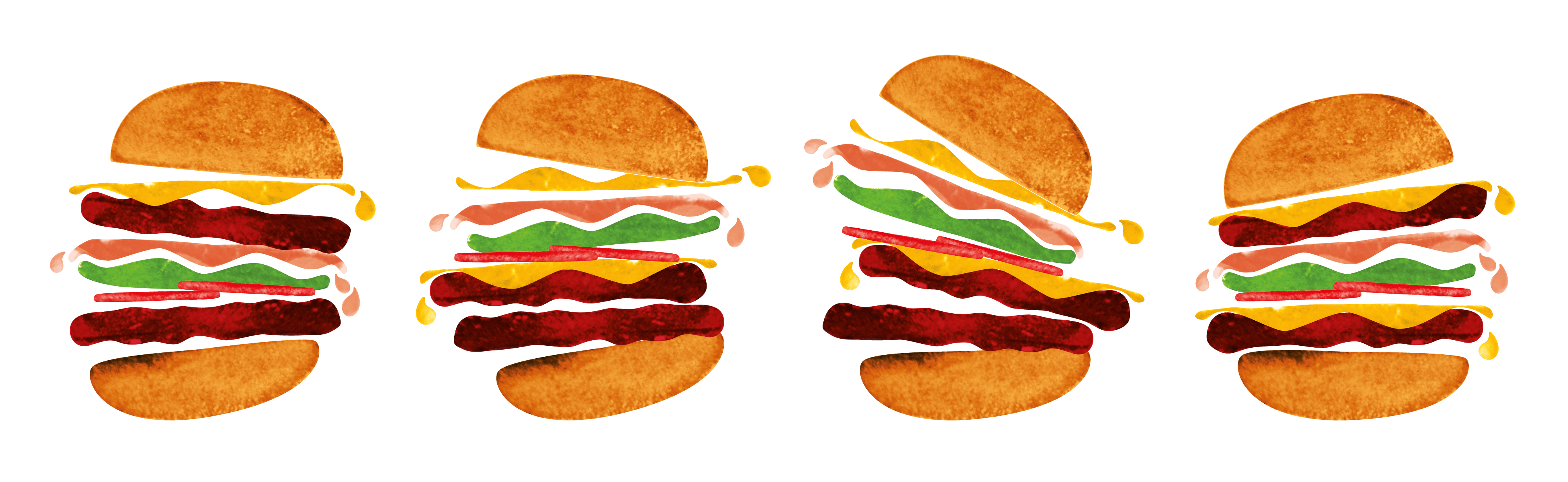
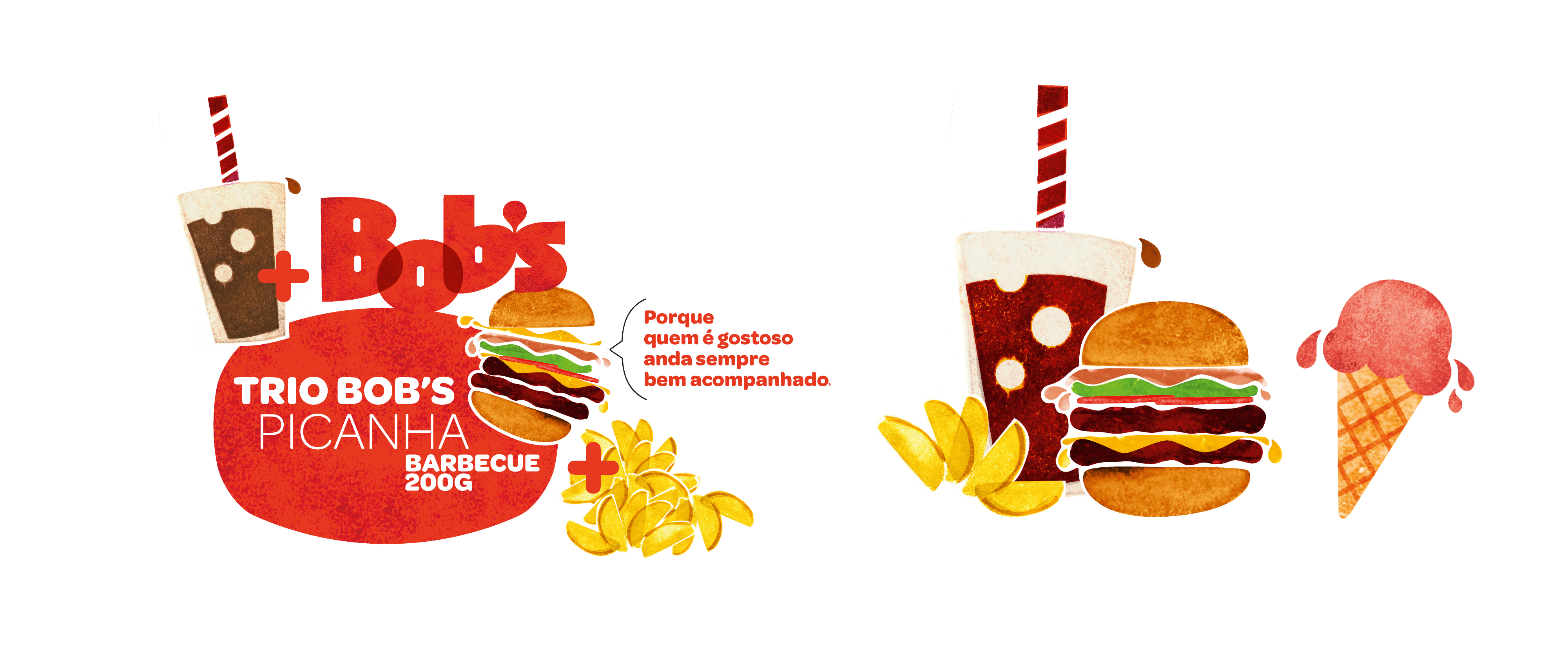
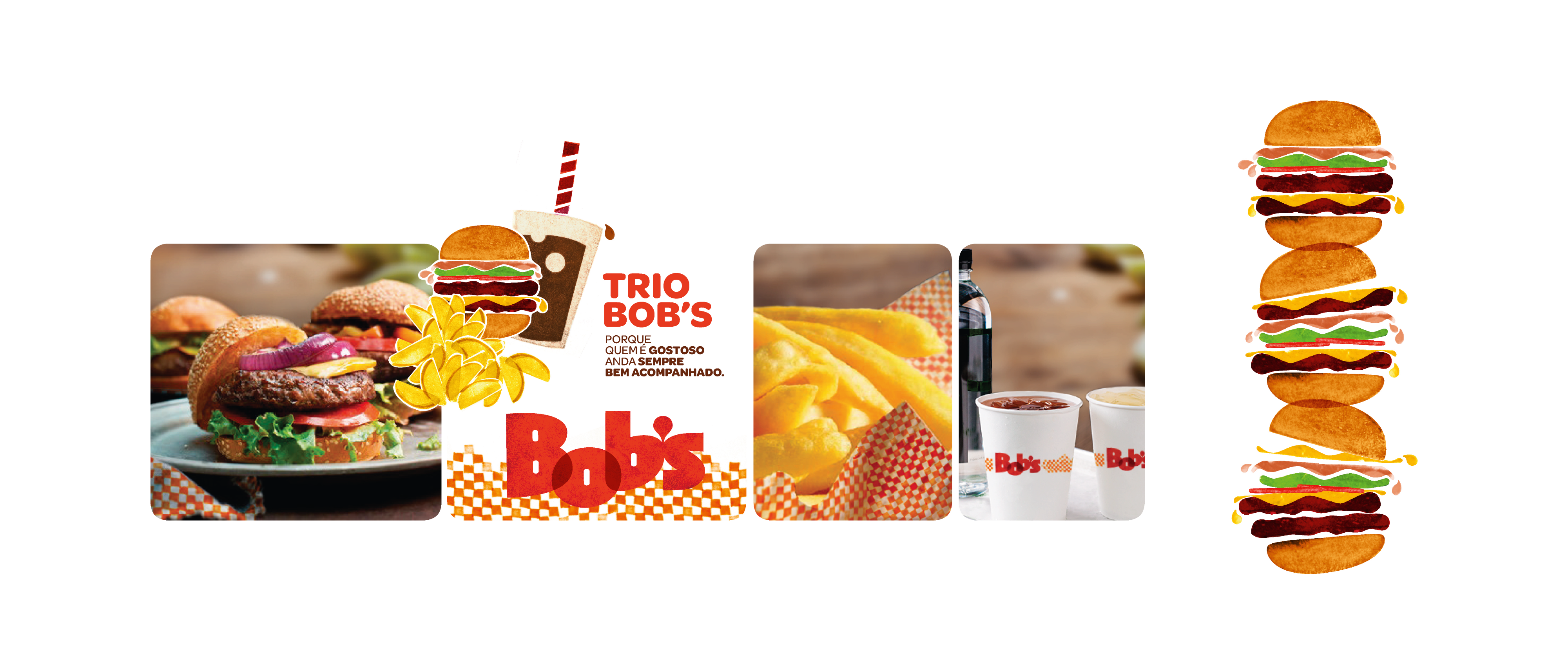
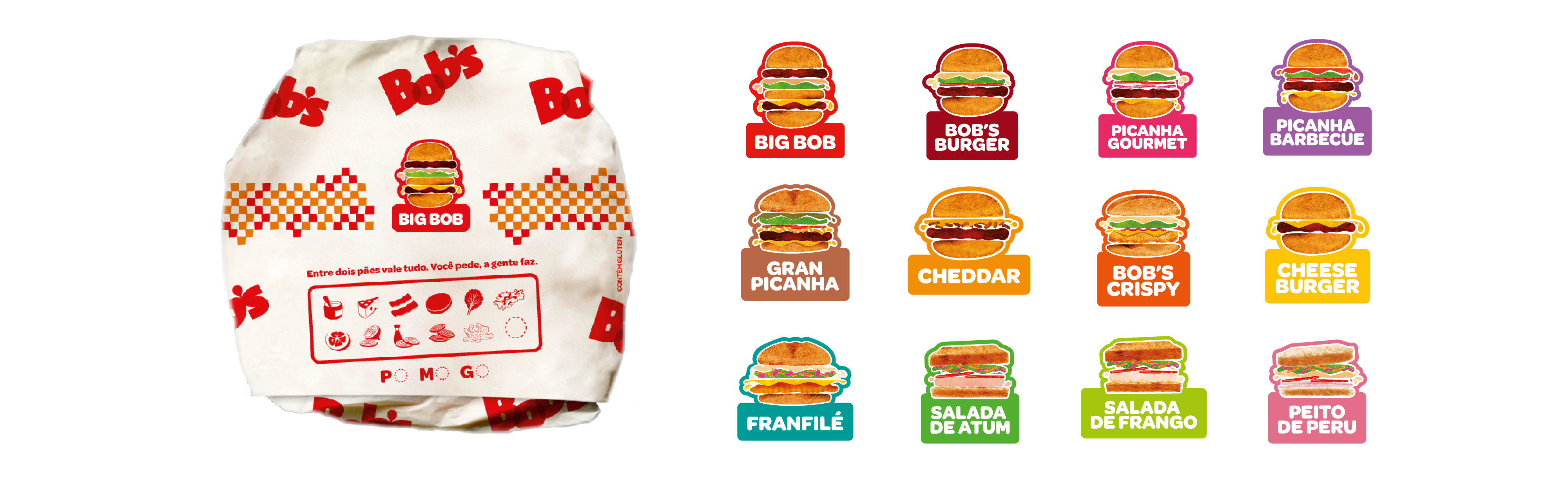
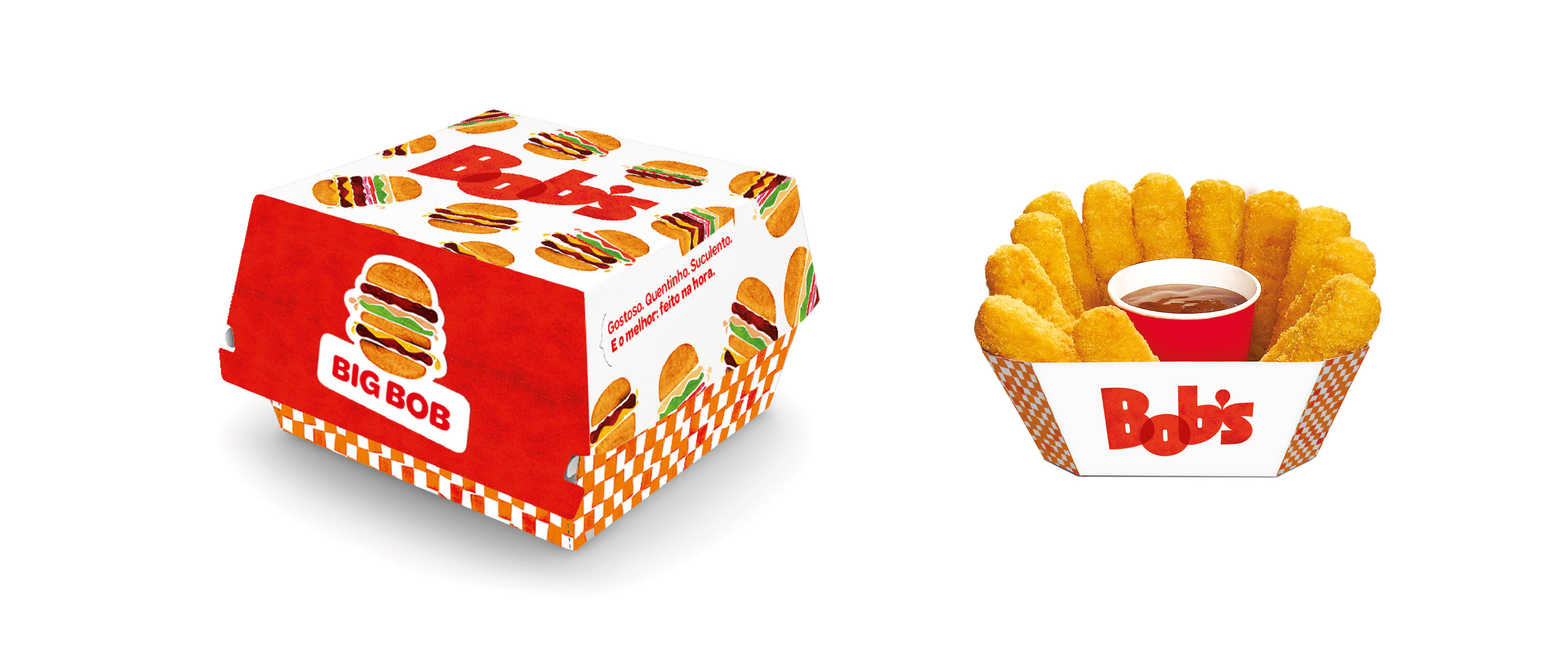
First off, we consolidated the new positioning into strategic tools. After that, we invited the entire team to draw their own Bob's, briefing them to translate authenticity, glut, and deliciousness. The process resulted in inspirations to create an original, spontaneous, and good-tempered brand, reflecting the immersive personalty of Bob's Burgers. We chose a handmade technique. We created stamps from one of the main and most delicious restaurant's ingredients: potatoes. Yes, the new logo was born from a real potato, hand sculpted, resulting in a very textured and sensorial look & feel.
Result
More than a dive back to its essence, Bob's took leverage from a set of expressions aligned with its new moment, resulting in more than 30% of sales incremental at its flagship store, and an approval index of almost 100%.
TEAM
Art director: Fred Gelli
3d Product Designers: Rodrigo Maia
Graphic Designers: Mariana Hermeto, Rodrigo Bessa, Isabel Goulart, Noel Rabacov
Creation Managers: Mariana Hermeto
Design Content: Ana Cunha, Pilar Rodriguez
Account: Bianca Cruz
My Role
Illustrations, iconography, brand architecture, signage and POS branding.
Prêmios Awards
Bienal Brasileira de Design Gráfico 2015 | Categoria Branding
Brazilian Biennial of Graphic Design 2015 | Branding Category