Careem
Rebranding
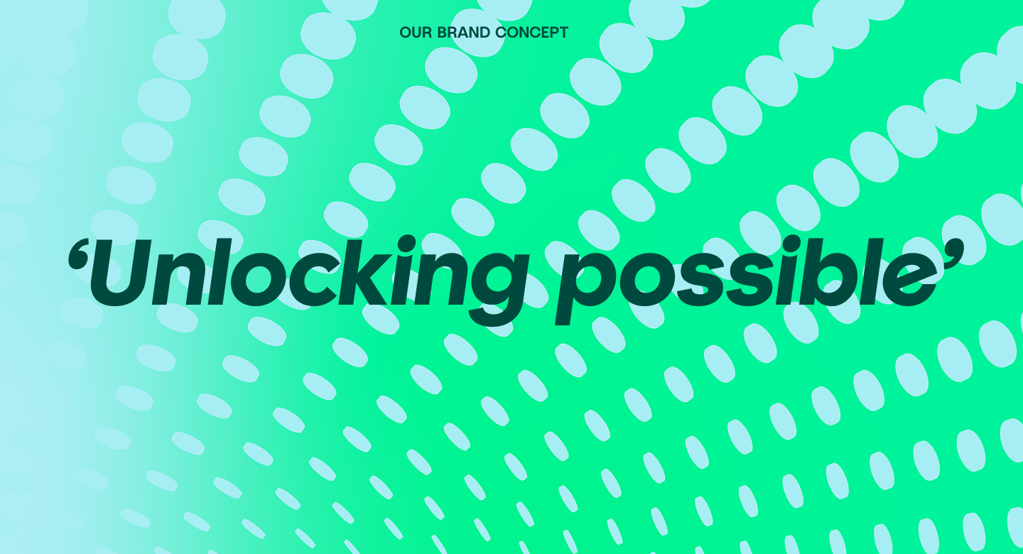
The Everything App
A refreshed identity for a local icon.PROBLEM
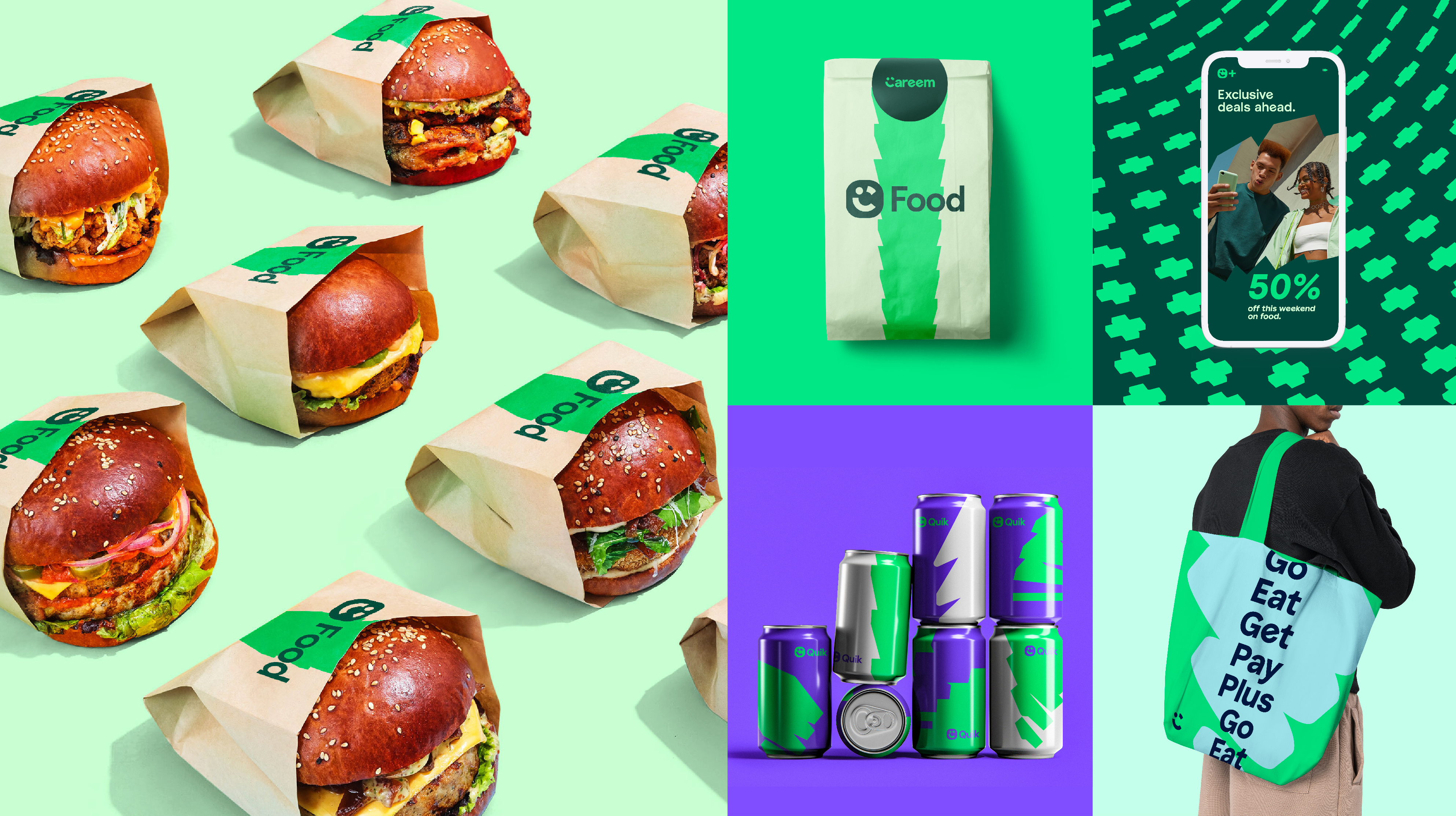
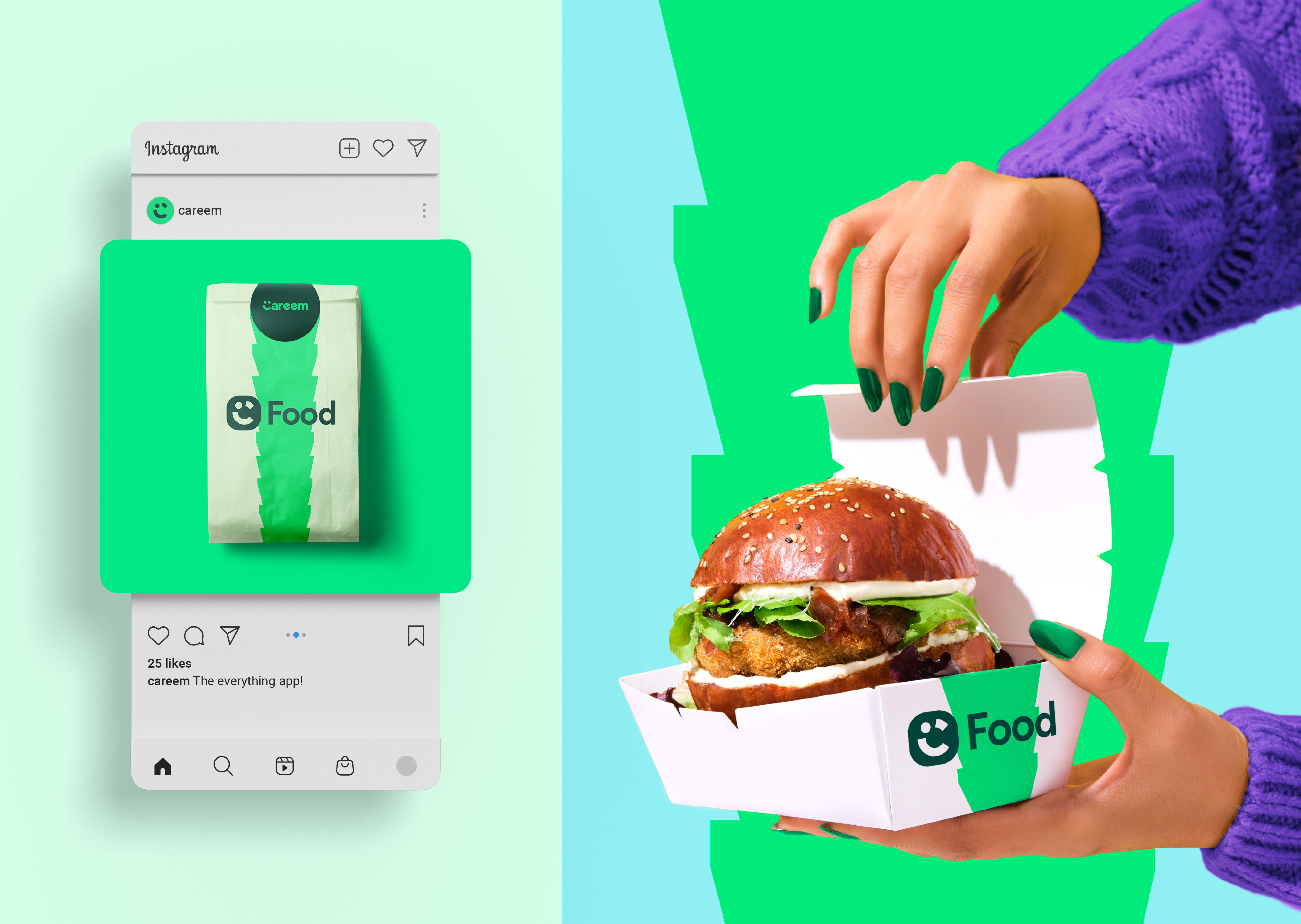
After ten years of building the leading ride-hailing app in the Middle East, Careem evolved from a single-service platform into a multi-service app. Faced with a perception challenge, we needed to rebrand ourselves and clearly communicate our transformation into The Everything App.
SOLUTION
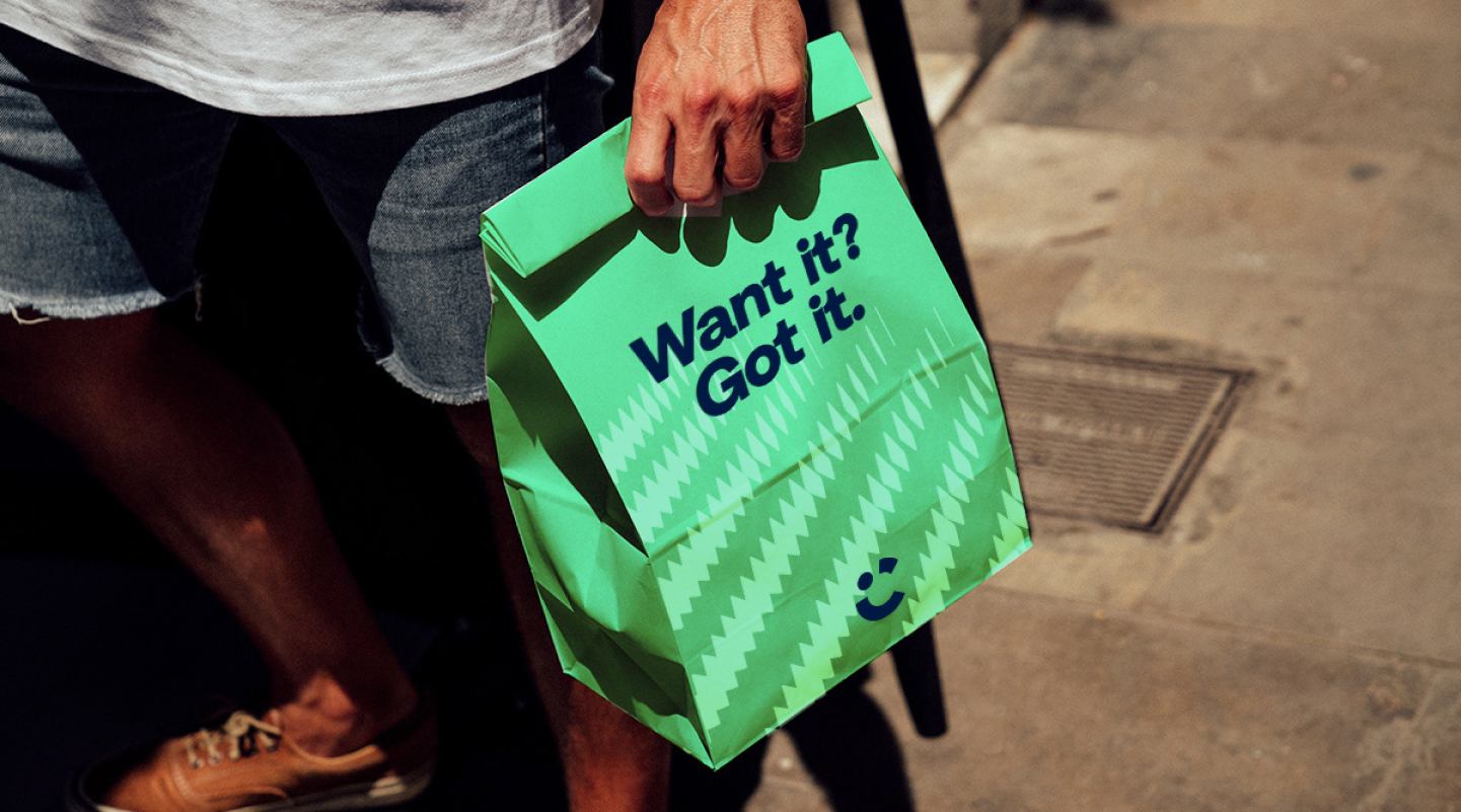
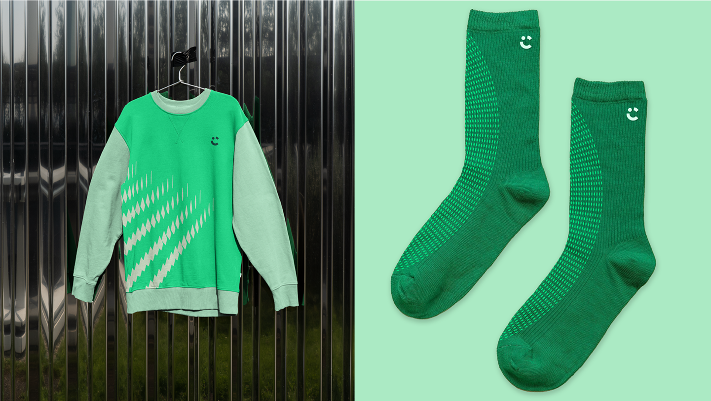
The original Careem brand held an iconic place in the region, especially its distinctive wink logo — a core part of our DNA. We kept this as the foundation of our evolved identity and built a completely new design system that honoured our heritage while reflecting who we are today. The goal was to create a visual identity that felt fresh, modern, and undeniably Careem.
EXECUTION
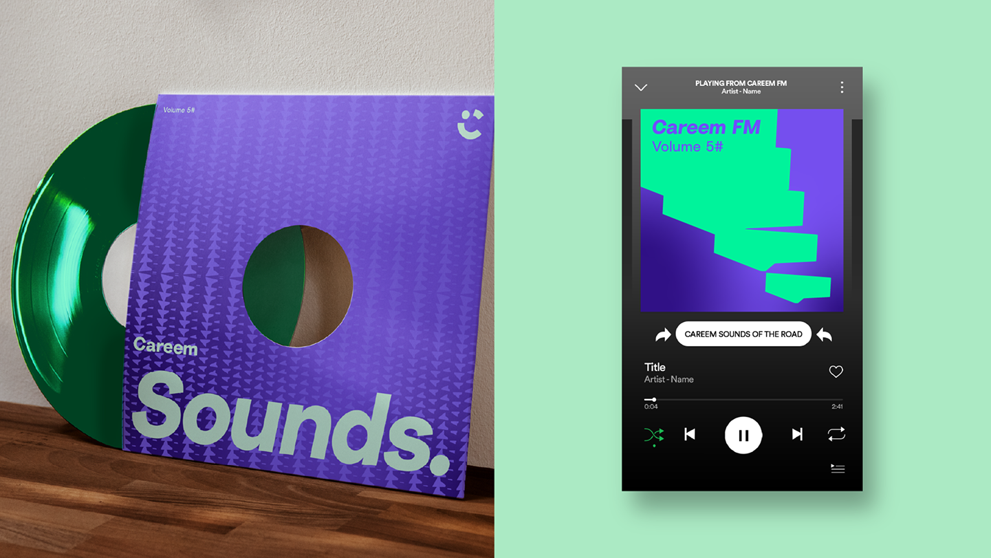
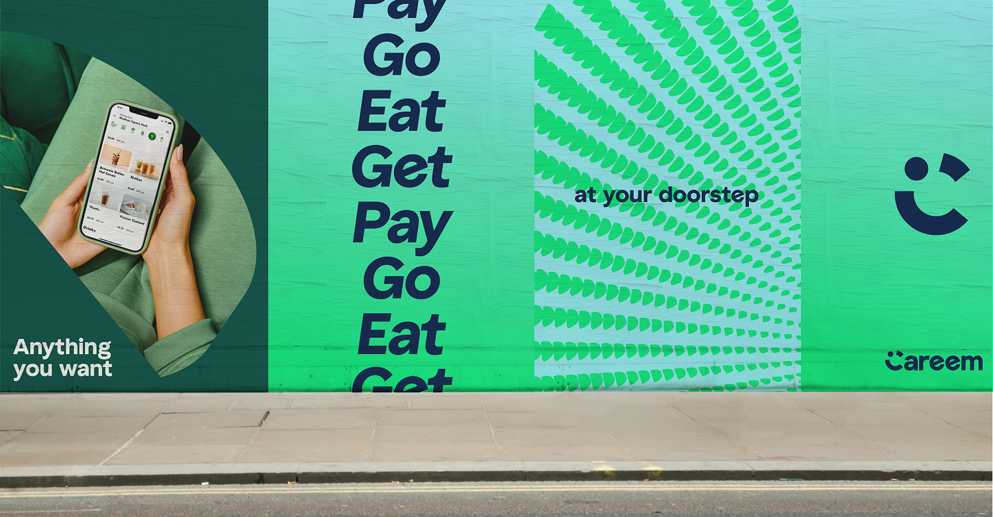
We began by defining a brand architecture that could house 20+ services across four categories: Go, Eat, Get, and Pay. From there, we developed a set of meaningful shapes that formed the base of our new design language — including a bespoke typeface, refined colour palette, art direction, iconography, and tone of voice.
MY ROLE
I moved to Dubai four years ago after being invited to lead Careem’s rebranding project — that’s how my journey with the company began. The project was developed in partnership with DesignStudio London, and I was deeply involved in every stage of the process, from concept to implementation.
After the DesignStudio handover, I took full responsibility for creating the Careem Brand Guideline and implementing the rebrand internally. I worked closely with the in-house design and marketing teams to translate the new identity into real applications, ensuring coherence, clarity, and consistency across all brand touchpoints. My role covered the development, refinement, and rollout of the visual system, helping embed the new brand into every aspect of Careem’s communication.
AWARDS
The rebrand received major industry recognition. I was responsible for creating the Case Study that showcased the project, which went on to win the Grand Prix and four Gold awards at the Transform Awards, as well as two Silver awards at the Dubai Lynx. This recognition reflected not only the strength of the creative concept but also the clarity and storytelling behind the Case Study itself.