Guaraná Antarctica
É Coisa Nossa
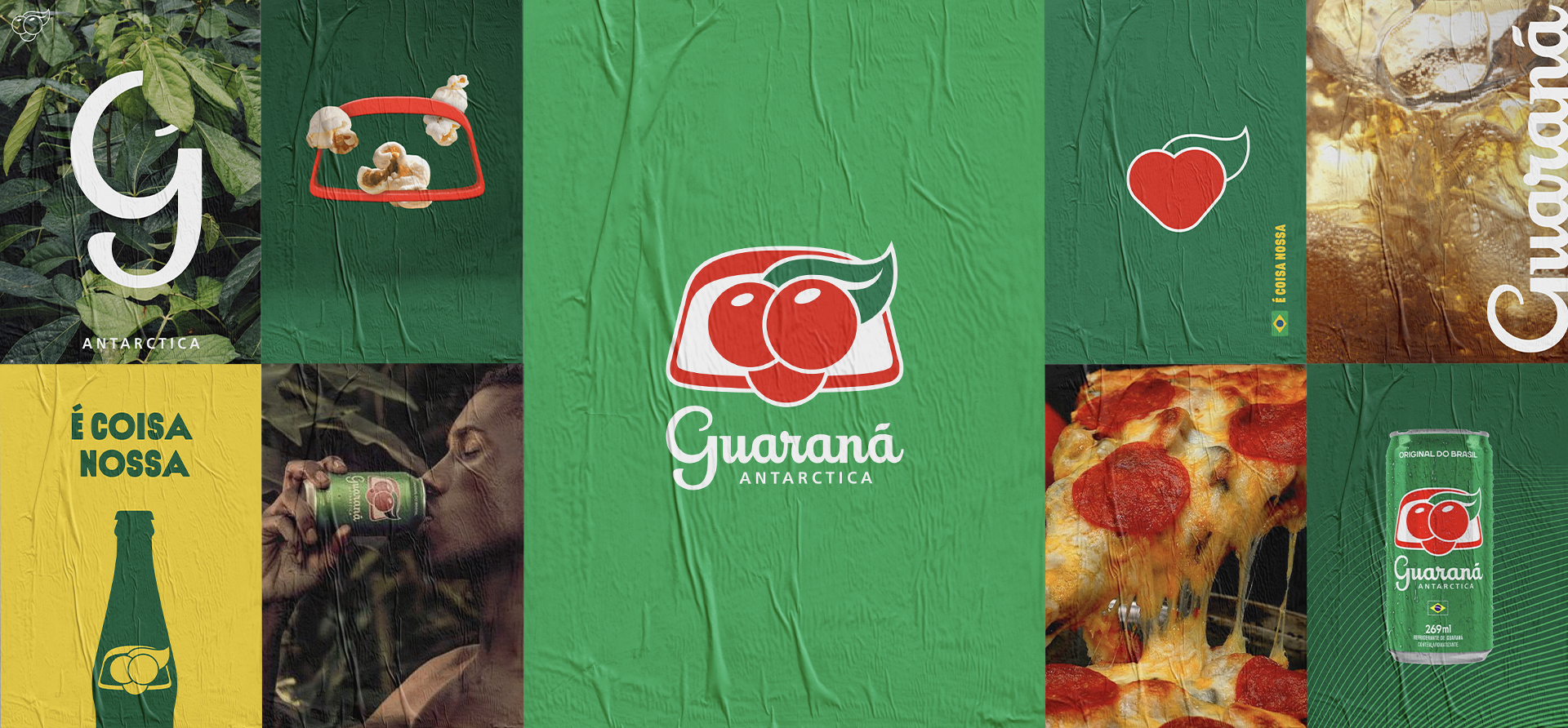
Guaraná is an Amazon Rainforest berry and the main ingredient of the Guaraná Antarctica soft drink. It's one of the most loved soft drinks in Brazil and competes head-to-head with Coca-Cola. It's a unique beverage that is hard to find anywhere else in the world.


2020
by GENAU DESIGN
for GUARANÁ ANTARCTICA
Ambev invited Genau to help redefine and strengthen the foundations of Guaraná Antarctica, one of Brazil’s most beloved and iconic brands. The project centred on the development of a brand book designed to capture the brand’s unique cultural relevance and authentic connection to Brazilian identity.
As we immersed ourselves in the brand, it became clear that the opportunity extended beyond documenting existing assets. We identified the need for a more distinctive typographic system that could better express the spontaneous, original, and unmistakably Brazilian spirit of Guaraná. The solution was a custom typographic approach built through the combination of different type styles and weights, creating a more flexible and expressive system inspired by the way Brazilians naturally mix influences, adapt, and create something uniquely their own.
A key contribution of the project was reimagining the iconic red frame, a long standing element within the brand’s visual universe. For the first time, it was proposed as an active storytelling device, celebrating the rituals, flavors, and everyday moments that make Guaraná part of Brazilian culture.
The work also included a deep exploration of audience personas, tone of voice, and photographic direction, creating a richer and more contemporary expression of the brand while remaining faithful to its heritage.
The resulting brand book established a stronger and more cohesive identity system. The typographic approach remains part of the brand’s visual language today, while the evolution of the red frame opened new possibilities for communication across campaigns and brand experiences.